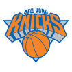
Knicks · NEW KNICKS LOGO !!! (page 1)

FrenchKnicks @ 6/23/2011 3:09 PM

Childs2Dudley @ 6/23/2011 3:13 PM
Uh?
MaTT4281 @ 6/23/2011 3:14 PM
I like it better with the black under the letters. Looked crisper.
FrenchKnicks @ 6/23/2011 3:15 PM
New unis might be shown tonight also !!
FrenchKnicks @ 6/23/2011 3:21 PM

matt @ 6/23/2011 3:22 PM
yeah I don't really get the all grey instead of the black.. it's not like there's any grey in the uniforms
FrenchKnicks @ 6/23/2011 3:23 PM
I love the alternate logo (the 3rd one I posted).
DrAlphaeus @ 6/23/2011 3:24 PM
FrenchKnicks wrote:New unis might be shown tonight also !!

Where you get this information from Frenchie? I see the new additions on the Chris Creamer site, but I wonder if they are official...

FrenchKnicks @ 6/23/2011 3:29 PM
You can find them on the official Knicks online store. They're consistent with the rumors we've had over the past 12 months (no more black on the logo and unis). Besides, draft day is usually when teams unveil their new identity, logo, colours, jerseys, etc.

Also, the new colour scheme is the reason why they wore their old 1970 jerseys last year as well. Those blue and orange jerseys were awesome, I hope the new ones look like those.

The Nashville Predators of the NHL have gone in the same direction with their new logo :

DrAlphaeus @ 6/23/2011 3:37 PM
No more black in the logo must mean they will draft Jimmer, right? I KID, I KID!

Some folks may love pouring over wingspan measurements, but I love talking uni-watching!

It's curious though, because the old logo had black even before they added black to the uniform. But I think dropping the black may make the logo more readable at smaller sizes, and it does harken back to the 80s logo... especially that alt without the triangle. But black is staying in the subway token alt though I reckon?

FrenchKnicks @ 6/23/2011 3:42 PM
I am more excited about the new unis than our 1st round pick tonight :D
Moonangie @ 6/23/2011 4:12 PM
The new logo looks nice. Gonna have to get my kids some new caps.
K22 @ 6/23/2011 5:59 PM
Shame - I liked the black. My favorite Knick jerseys were the ones from '99.
VCoug @ 6/23/2011 6:23 PM
I like it especially this one. The font is still chunky but at least it got rid of the cheap shadowing effect.
MaTT4281 @ 6/23/2011 6:36 PM
K22 wrote:Shame - I liked the black. My favorite Knick jerseys were the ones from '99.

Same. Although I really do like the alternate jerseys we had last year, just solid blue. I thought I heard we were going to use them more regularly this year.

JesseDark @ 6/23/2011 6:54 PM
The upper right corner looks like a microwave or an old desktop monitor.
Page 1 of 1