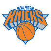
How ugly is that new logo on court ? That light blue colour reminds me of the Liberty, and the bright orange doesn't even match the one in the paint

They had everything right last year with the great classic blue unis.. I wish they'd have built on that, make the 1970 unis their primary both at home and on the road, and change the logo by erasing the triangle...
Instead, we now have a girly logo... welcome to the New York Lady Knicks
The new logo is really only different by the light gray in the triangle which was formally black.
The retro uni's are great and I too would like them used as often as possible.
The New logo looks great when we win!
I like the new center court logo and I also wish they would officially go with the old jerseys they were during Melo's Knicks debut
FrenchKnicks wrote:How ugly is that new logo on court ? That light blue colour reminds me of the Liberty, and the bright orange doesn't even match the one in the paint They had everything right last year with the great classic blue unis.. I wish they'd have built on that, make the 1970 unis their primary both at home and on the road, and change the logo by erasing the triangle...
Instead, we now have a girly logo... welcome to the New York Lady Knicks
+1
I am not a fan, perhaps not as sour on it as you, but I definitely agree with your second paragraph