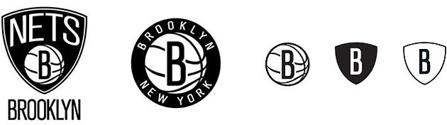
Uniwatchers, we have the Nets' new look revealed. Logo designed by Jay-Z. Colors are black and white.
http://nba.com/nets/
Logo almost seems too simple, but black and white a clever switchup, get some of that Spurs swagger. Probably an attempt to look like the Bad Boys of NYC basketball.
yeah, B is for swagger. oh wait no it's not. B is for BS.
Wonder if Deron's dying to get that contract signed so he can play for the Brooklyn B's.
I agree, the black and white will sell in NY.
Spurs are silver and black so unless they start shading the graphics it will certainly have a distinct look.
The Icon of the gothic arches in the bridge is very cool. I wonder if they incorporate that on the jersey
In a world where the OK thunder road uni's look like knicks, and every team copies each other to some extent its good to see a different style.
Nets get to totally rebrand themselves.
Now if they can get that roster "rebranded" some what they might have something tangable to put on the court.
They might have lucked out with Dwights back in the long run.
Im looking forward to getting to NY and seeing a KNick and Net game!
Looks c***, but then again so do all the new logo's from the Vancouver Grizzlies onwards. Grizzlies, Raptors, that Rockets one from the 90s, the Wizards, The Piston one from the 90s, the Sixers one from the 90s, the Thunders, the Bobcats, The Magics, everyone is an absolute stinker- what has happened to logo designers?! It's gotten so bad teams are just reverting to their old designs from 20 or 30 years ago!
Also I find it hilarious when they announce the logo, and the designer says all the things it represents:
JAY Z believes the design's boldness demonstrates confidence in the new direction.The secondary logo, of the 'B' inside a basketball, surrounded by the words "Brooklyn New York" immediately popped an image into my head: "Planet Brooklyn."
No it doesn't- it's a letter B on a basketball, in black and white!
Overall I like it. It fits more with Brooklyn than the old color schemes. The B is wrong tho for a NY team. We usually use a font that is old school NY Times like in Nature. The B and Nets font is a bit too bland. I can actually see myself rooting for them to succeed in Brooklyn. Funny thing is I was a HUGE Dr. J fan as a kid. I went to see him play at Nassau Coliseum. I then used to root for the Sixers whenever they were not playing the Knicks. As a kid it was easier to follow a favorite player like that.
Wow.. that logo looks just as bland as it could get- just like that team.
Talk about WACK graphic design... Heheheheh... That is the best that the billionaire Prokhy coould come up with, I guess. What a waty to re-brand and re-invent themselves.
That blase' logo will be a perfect fit for the D-Leaguers who they'll have to get to populate their roster after Deron, jheri curl Wallace and Farmar ALL opt-out this summer as they said they'll do. Muhahahahaa!!! 
Black and white is just boring.
This link seems to have a wider selection
http://www.modells.com/category/nba/broo...I too tend to like a "traditional look". some teams should never mess with it. Knicks, Yankkes, Celtics, Red Sawz, Reds, Lakers, Etc are examples of good branding because its build off success and history.
teams that don't have it or "times change" sometimes need to rebrand.
The Rockets and Astro's have a "space" theme. Back in the day, it was "futuristic" but now its "retro"! Sacremento "kings" is tired. "Kings" is tired. The old Cincinati "royals" which became the "Kings" needs a shot in the arm.
The Wizards last championship was wearing those current retro style. They are trying to reconnect with a succesfful time.
The Thunder went very conservative. There was no regional link to connect.
The Marlins redu was pretty easy. Capture "Miami" and its colors. Also, the Marlin fish itself is very cool.
"Nuggets" itself is pretty dumb. They were the "Denver Rockets" in the ABA once upon a time. We all know the Jazz should be in NOLA and the Hornets in Charlotte. The HOrnets was a nick name for a battalian in the Revolutionary war. If you ever got stung by a hornet, you'd also say its a badd ass bug!
What is very good graphic design for sports teams? The iconic Oakland Raiders Logo when by itself is the dumbest thing but lost on the uniform its still works. 
The Nets iniform has yet to revealed and we won't see that until the End of september.
Its not really for knicks fans to like it or not, its to create at distinct look and create a brand identity all its own.
They might have done that.
HARDCOREKNICKSFAN wrote:Wow.. that logo looks just as bland as it could get- just like that team. Talk about WACK graphic design... Heheheheh... That is the best that the billionaire Prokhy coould come up with, I guess. What a waty to re-brand and re-invent themselves.
That blase' logo will be a perfect fit for the D-Leaguers who they'll have to get to populate their roster after Deron, jheri curl Wallace and Farmar ALL opt-out this summer as they said they'll do. Muhahahahaa!!!
Wallace and Williams both said they were opting out. Billy King took all of those assets that Thorn had accumulated and lost them. I don't know what they can do to become a marquee franchise. The move probably helps but they were loaded up to make moves and nothing has worked out for them.
Brooklyn Nets Logo looks sick. Brooklyn will get talent even if they have to pay for it.
If they lose Williams I expect them to go after Tyreke Evans. They need someone to put fans in the seats. A Brooks and Evans backcourt could be entertaining.
Knicks will be king of New York for the forseeable future though.
This is so much win for New Yorkers. Two teams 20 minutes apart by train.
I remember hearing in regards to good national flag design that if it's too complicated for an elementary school kid to draw in crayons, it's a bad design. I think that could extend to sports uniforms. A kid has to pull out God knows how many crayons to draw a Thunder or Miami Marlins uniform.
I'd rather see the trend towards simplicity than 3D-everything.
wow, talk about lack of imagination. they are obviously after the old brooklyn dodgers fans....eh except they are like a whole entire generation to late.

Rookie wrote:wow, talk about lack of imagination. they are obviously after the old brooklyn dodgers fans....eh except they are like a whole entire generation to late.
Yeah but that B is much more in the style of Lettering that NY teams have traditionally had and I think it would've been better to find a similarly styled B with a bit of a modern edge to it.
![]()
nixluva wrote:Rookie wrote:wow, talk about lack of imagination. they are obviously after the old brooklyn dodgers fans....eh except they are like a whole entire generation to late.
Yeah but that B is much more in the style of Lettering that NY teams have traditionally had and I think it would've been better to find a similarly styled B with a bit of a modern edge to it.
Isn't that what they did?
Its old school font but not for baseball, but looks like 50's baskeball type graphis. Old Dodgers looks turn of the century.
Glad it has its own look then take from the Dodgers. I do think it would be cool, but this has its own look entirely.
The "B" with the "Brooklyn new york" in the circle looks great. The Sheild not so.
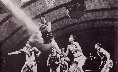
I have to admit, it looks good to me. Works the nostalga thing for me. Before my time Black and white Images of Lou Alcinder in a "POwer Memorial" uniform......

Nate.....
Brooklyns own BIlly Cunningham....
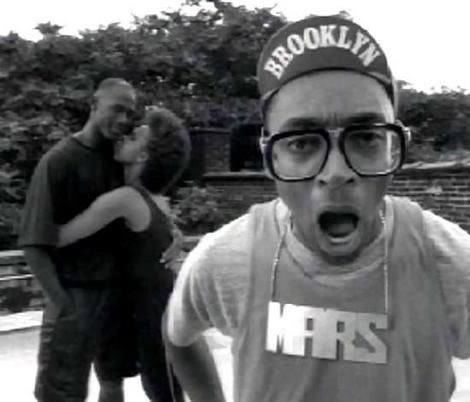
This guy is Brooklyn too!
All before my time also, but baby boomers remember the links to the past as a kid. I read about these guys and saw these old BLACK AND WHITE photos. Boomers are nostolgic.
Brooklyn is a nostolgic type of place for people who don't live there. For those that do, they are linking to a glorified time when brooklyn was on its own one of the largest cities in the country, when they had thier own baseball team, and they were proud of being "Brooklyn".
I get it.
The Roster, thats another thing all together!
Wow, I think Jay-z over thought this one. Only thing the logo needed to say is Brooklyn.......the name sells it's self.
I mean Brooklyn with a basketball net under it makes more sense than Nets with a B in a Basketball.
I gotta admit I like the logo. About the only thing I've seen come out of New Jersey. No I can't stand Bon Jovi
If the Nets can't keep Deron, they should try to add Lin to Brook.
Knicksfan wrote:If the Nets can't keep Deron, they should try to add Lin to Brook.
Lin in a Black/White Jersey will look sweet. Great design, great color combo and Brooklyn Nets sounds mighty fine.
Clippers needs to go back to San Diego. There goes another team that would have looked sweet in a black/white jersey.
Anji wrote:Wow, I think Jay-z over thought this one. Only thing the logo needed to say is Brooklyn.......the name sells it's self.I mean Brooklyn with a basketball net under it makes more sense than Nets with a B in a Basketball.
Yeah I think Brooklyn its self is a killer like you said, maybe they do that as an alternative jersey.
Pulling some sort of sign and trade of Lin for Deron trade would be the most amazing thing ever, though I don't know if its possible.