The designs might not all show up great on TV. Players get lost in the design.
FVV, Rockets with him and Brooks add to the youthier core they are building with. Fun team to follow the next few years.
Martin, I’m with you and that red is even worse. Did not see that until now.
Never liked extra paint on the court while playing. Always more slick around the logo.
I do not like it as a fan watching on tv. Might be my age now and my sensitivity to bright colors.
wonder what the players think. Personally I'm in that same old person boat- wonder if they are trying to appeal to the video game crowd.
Them new court for those games are Horrible
worst than actual NBA game scenes which is acceptable
Still not as bad as the Celtics home court. Hurts my eyes every time, even when the Knicks win.
I don’t like the black halfcourt design for MSG home games. I keep thinking we are playing in the Barclays center
I think someone meant to microdose but fudged the intake.
I have a 4 year old 4k TV, but it has a billion shades of colors, and they make those courts really stand out. Trippy lol.
KnickDanger wrote:I think someone meant to microdose but fudged the intake.
Me, yesterday.
martin wrote:KnickDanger wrote:I think someone meant to microdose but fudged the intake.
Me, yesterday.

Expecting eyes to really hurt on Friday. A bright orange court cannot be good.
SergioNYK wrote:Expecting eyes to really hurt on Friday. A bright orange court cannot be good.
I gotta fudge the microdose again?
I had no complaints about the orange court. It wasn't nearly as shiny and bright as in the photos beforehand.
How about you guys?
Almost all these new designs are horrible.
Jerseys used to be iconic (some were bad but at least they had character)in the 80s and 90s, then everyone went minimalistic and now they've ruined the entire courts..
At least one thing the Knicks always do well is not stick out. Jerseys never had to be fancy and the court design isn't yucky like some of these other ones
SergioNYK wrote:I had no complaints about the orange court. It wasn't nearly as shiny and bright as in the photos beforehand.How about you guys?
I agree. The orange wasn’t that bad, I’ve seen worse. Maybe I’m sensitive to red more than orange. But those bright red courts are the worse for me.
NYKalltheway wrote:Almost all these new designs are horrible.Jerseys used to be iconic (some were bad but at least they had character)in the 80s and 90s, then everyone went minimalistic and now they've ruined the entire courts..
At least one thing the Knicks always do well is not stick out. Jerseys never had to be fancy and the court design isn't yucky like some of these other ones
Ah, the "Good old days".........
The 70's? Knicks I agree were simply elegant as an original NBA team should be.
Im not crazy about wearing white on away games. But its the smallest of gripes!
These? I always tilt to the iconic unis of the championship years. At the same time the Bullets uni's were great. Always liked this version with the v-neck and how (not pictured) the names on the back were. Small, to one side. Not everyone liked them! The ABA had some graphically unis going then. The nets with the stars (Dr J Era) was a big departure from the norm then.
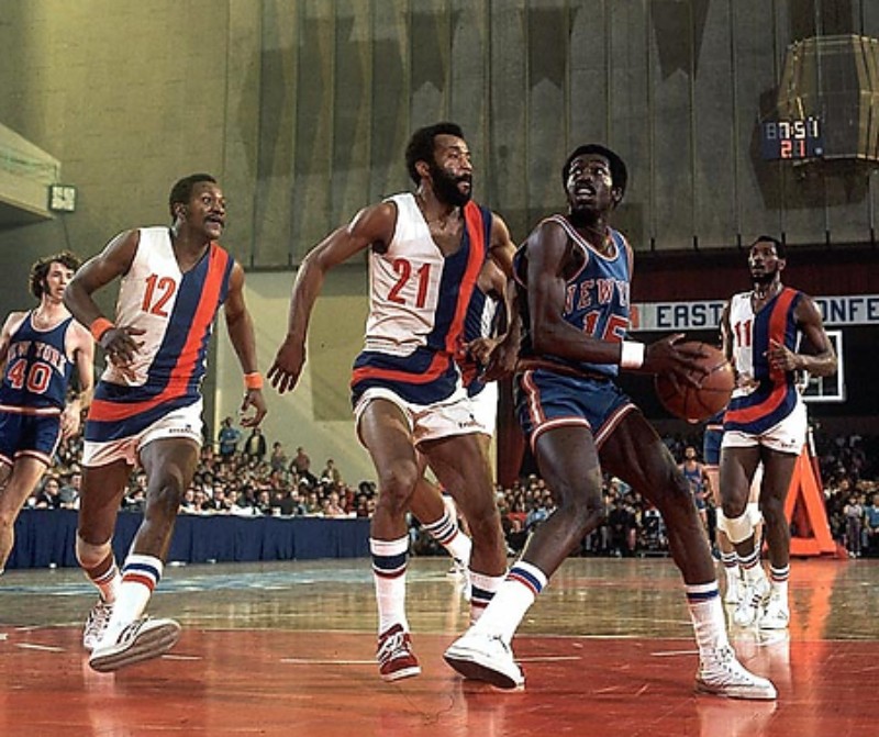
They were cool then and now!!!!
Notice The knick lettering was Red and compare to the orange on the Bullets. Knicks have changed from Red to orange as it picks up better in photographs. As discussed many times "Reds" in the digital realm is a very difficult color but very prevalent in the sports world.
Personally I don't watch sports in "vivid" or "sport" mode on the TV. Too bright!!!!
Maybe it’s because my Samsung 65” is dope af, but I love the new courts. I don’t want to see 82 games like that… but I am a fan overall. I think they need some tweaking but I like that they present the games to us in a way that feels different. It’s not. But it certainly feels that way