Any news on if they made changes this year? A new NBA 2K13 gameplay video came out on youtube today with some shots of the Knicks. The Jerseys looked awesome. Still had the medallion on the back above the players name, but the rest is just like the mid 90's uniforms. I really hope they got the jersey designs before they were made public because they look great.
Seen the screen shots they look good I wanna see them in a non virtual way though 2k does a shitty job with coloring everything always looks faded and extremely light
The medallion is actually different- the NYK has gone and it says 'Knicks' instead- black has been removed from everything and the blue and orange are lighter. There is no trim on the sides of the uni's, and a white, grey and orange trim round the neck, and only half way down the loops of the arm holes. White, grey and orange trim round the leg of the shorts, and only orange trim round the waist. Also the New York font on the front is different- there's some photos on th Knicks forum on realgm.
So they are different from the 80s uni's. Personally I liked our 90s uni's and the ones we had last year, but I'm not going to cry about change!
The '99 jerseys are still my all-time favorites.
OK, I found it : http://www.operationsports.com/news/569282/nba-2k13-video-developer-insight-2-gameplay-part-2/
Look for the 1:21 mark on that video. Those new jerseys are terrible... just as good as the new logo... this organization just can't do anything right.
Uniforms? Really?
I wish they incorporated some fusca?
mrKnickShot wrote:Uniforms? Really?I wish they incorporated some fusca?
Haha! Hey, that's what's great about sports: there's something in it for everybody. Numbers for the nerds; sweaty, muscular men with wingspan measurements for those of us obsessed with the body fat percentage of strangers; all that pomp and circumstance; back room business shenanigans to rival Wall Street, and... FABULOUS FASHION! for us sartorially-minded folks.
Are they replacing the subway token alt above the player name with this?

I think its the 21st century remix of the alternate from the Championship years. I love the old-school hand-drawn feel, you can damn near smell the India ink on this joint.

I hope they don't mess up the way "NEW YORK" looks on the front, with that curve on the bottom of the letters, 'cause I like that.
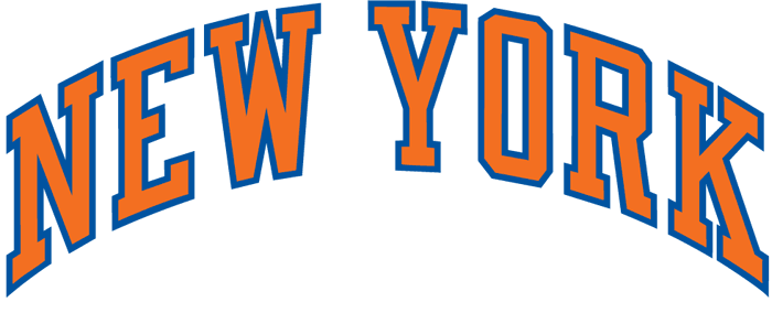
I guess they are finally "ditching the black". (I really rather the Mets do it than the Knicks. I hate that black & blue hat...)
I too favor the 99s unis... nostalgia? I don't mind black in the Knicks uniform, but grey is fine I guess. Yielding the black to the Franchise Whose Name Shall Not Be Uttered across the East River?
I wonder why not just go full on old school with only orange, blue and white: especially since it's the 40th anniversary. They wore those throwbacks road jerseys all the time last year, I could get used to that.
smackeddog wrote:The medallion is actually different- the NYK has gone and it says 'Knicks' instead- black has been removed from everything and the blue and orange are lighter. There is no trim on the sides of the uni's, and a white, grey and orange trim round the neck, and only half way down the loops of the arm holes. White, grey and orange trim round the leg of the shorts, and only orange trim round the waist. Also the New York font on the front is different- there's some photos on th Knicks forum on realgm.So they are different from the 80s uni's. Personally I liked our 90s uni's and the ones we had last year, but I'm not going to cry about change!
Ah so they are getting rid of the subway token alternate, huh. Is the logo I posted the one you are talking about?
They still have their subway token alt on the knicks.com homepage. With a Chase Bank logo underneath. I could see them putting the Chase octagon on their uniforms if that ad patch proposal goes through. Citibank replaces Shea Stadium (a Parks Department facility!)... now a Chase logo on my Knicks? Sigh.
New light blue / gray token on the back of the jerseys, and the lettering is flat now, no more curve like the old front lettering. Besides, they ditched black on the jerseys to add that very light blue / light gray color on the logo and the jerseys, which is a terrible move. They should just have gone back to the 1970 jerseys.
Terrible, I hope they at least get a 3rd road uniform in Gray or Orange
Lets create new legacy. Perhaps the new jersey's become the new fashion for the new era that we look back and youtube the "Championship year of 2012-13"!
Knicks win and we'll love those new jersey's forever!
Changing the color of the road uni is big deal. OKC has a very similar look but I thought a lighter blue. I hope we don't look too much alike!
I actually like these changes if that's what they're gonna do. You could see that they were moving away from the color theme of the last decade or so last year. It's a cleaner look. The Black elements are passe now. I guess this is a more Metro Sexual look now

Softer more pastel colors. We'll see if this is for real, but I kind of like it.
I really liked the 90s uniforms too but I think that works better then than it does now. I like this direction a lot. the Knicks colors are orange and blue and I'd like to see those as the colors of emphasis
'99 away jersey was the best. Why are they dropping the black, because of the N*ts? [there ya go, Nalod
] They going to drop the white too?
Still can't find an away XXLT Spree jersey worth a shit anywhere.
You Look Good. You Play Good.
Excellent take Dr. A. Love the retro logo. Now if they could fix the detailing on the shorts, never liked the way the vents and side detailing was handled. The classic sixties shorts could be a reference point. Without the belt of course.
My all time favorite uniform

SupremeCommander wrote:I really liked the 90s uniforms too but I think that works better then than it does now. I like this direction a lot. the Knicks colors are orange and blue and I'd like to see those as the colors of emphasis
Funny they are doing a change this year. I would have figured next season when teh garden is finished its renovation they would have rebooted the look but maybe new signage is starting to appear and the new look has to be installed at the same time.
Next year the scoreboard and Dolans Bridge gets installed with a renovated ceiling. Im looking forward to seeing that.
yeah, too bad they doing it this year when teh N*ts are rebooting their Brooklyn branding.
Makes the Knicks look insecure. We know the "little man" is!
The Knicks were already planning this remodel for years and I'm sure the new look was part of the overall plan. Teams do this sort of thing all the time. It's a good idea IMO. The timing seems about right to me.