Awesome. Love these Jersey's.

Rumored perhaps? From a "figurine" company.
Much cleaner look than some of the others floating around.
More concerned about the Knicks road look. GOtta have our boys look sharp on the road!
Nalod wrote:Rumored perhaps? From a "figurine" company.
Who knows?
That's the jersey, not the other photo posted slightly earlier. There was a thread over on another site with some photos of the black road jersey too. Not a fan- very boring, but some folks will like it, just like they'll like that horrible rusty look of their new arena. Still, compared to most new jerseys both the Knick and nets ones are fine.
Seriously- what happened to jersey and logo designers- OKC, bobcats, those warriors ones a few years ago, the raptors and grizzlies originals; the rockets post champiships, jazz and pistons from a few years ago, the wizards- every new design was disgusting and nearly every team went back to their old designs.
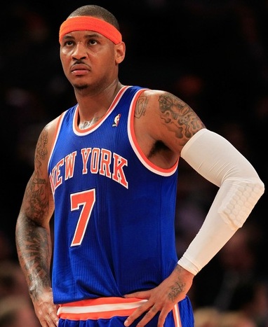
I guess the NEW YORK stands out more. Looks good
And this...

"Once a Knicks...Always a Knick(Except Jeremy Lin)"
Man, the home unis definitely need the side piping they took out. Don't like the all-blue belt. Too overwhelming. May make some of our players look a little soft in the middle.

I like the field of white north-to-south with the side piping as the frame on the old ones.
The away uni still looks ok. It's harder to mess up that up, and I like the orange belt in this case.
I also think they took away too much of the curve in the "NEW YORK" text. Looks like they took some life out of it.
the piping was partially removed for asthetics and comfort.
Looks like the blue is not lighter.
Can't really say I like it or not untill I see a full shot of the players wearing them.
I like the traditional look and glad they did not move away from it.
My hope is they are still wearing them in JUNE!
Yea, and Tina C. said they changed the "NEW YORK" curve (and the underarm piping?) so they could pop it off their chests easier!
matt wrote: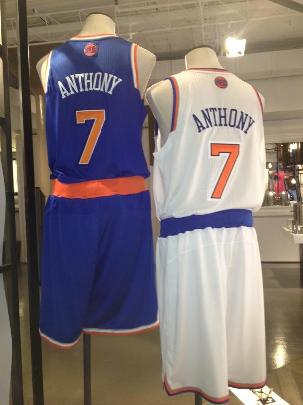
The away uniform looks great. Like that new alt on the top.
I like them a lot. They look like the ones from the late 80s/mid 90s with a twist. They are basic, but definitely nice.
This is still by far my favorite Knicks jersey, the colours and proportions are perfect :
These are the new Knicks jerseys, not bad, but :
- the gray doesn't belong there
- the shoulder piping is weird
- the belt is too wide and lack a stripe
- the words NEW and YORK are too close
- the proportions of the words NEW YORK and the numbers are weird
- the front numbers look too slim
- the triangle on the main logo should be deleted

Why couldn't they just stick to simplicity... :( Damn marketing
The thick belt is obviously so Novak has an easier time doing his move
Its all about modern and comfort. The thick blue and orange belt is awful. Totally unnecessary
I like the new uniforms. Classic but with a modern twist.
The "NEW YORK" looks too small.
Im glad though N*ts are not putting New york on the road uniform.
From knicks new uniform Im getting a "sixers vibe" form them:

I suppose every new is always going to meet some resistance.
I guess was can be happy there is no "Gotham art deco" theme to it.
Its clean, its simple, and its still very familiar.
They win a chip with them it can be an iconic look going forward.
Me, I like the old style best.
What a huge improvement over the old jerseys. They finally got rid of the black, which had no business being on a Knicks jersey, and the gray that was added can only barely be seen. The arc on "New York" will take some getting used to but it looks nice and I like the skinnier/taller numbers. I LOVE LOVE LOVE the alt logo on the back; I like the old subway token logo, and preferred it to our main logo, and this one just blows it out of the water. The only real negative is the thick blue waist band on the home jersey. It needs to be broken up with another stripe like on the classic jersey or it should be changed to orange. Overall, I'd give our old jersey a C- and our new jersey a B+/A-
I dont get why the numbers look so small and really lacks a orange stripe on the belt