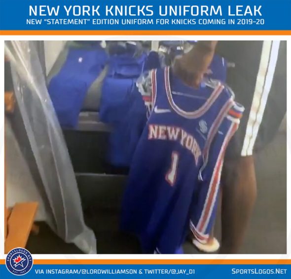
I love the shorts, the stripes, the fact they kept their identity... can't wait for media day !
Would like to see a new Knicks logo. Overdue. Maybe making the playoffs will get the ball rolling.
GustavBahler wrote:Would like to see a new Knicks logo. Overdue. Maybe making the playoffs will get the ball rolling.
No thanks to that. Maybe a tiny change to the current one like they always have but a brand new logo? No thanks.
1999 - Bring back the Black!

jrodmc wrote:1999 - Bring back the Black!
I loved the black. With that said, if we want to go retro, we might as well bring back Father Knickerbocker.
wow some real news
I hate them, I don't like how prominent white is. We're orange blue afterall
jrodmc wrote:1999 - Bring back the Black!
I like the "Triangle" logo too!!
Also dig the downward Triangle Pagan symbol for water.
I like the variations of uniforms with the retro slant. I generally reserve my opinion to see them worn before I decide. Looks like the early 70's pant with the side strips. The shirt looks fresh. As an alternative from time to time, Im good with them.
They all look better after a win!!
SupremeCommander wrote:wow some real newsI hate them, I don't like how prominent white is. We're orange blue afterall
Same here. It looks a little to Sixers like for my taste.
NYKBocker wrote:SupremeCommander wrote:wow some real newsI hate them, I don't like how prominent white is. We're orange blue afterall
Same here. It looks a little to Sixers like for my taste.
What about those old green jerseys? 
Allanfan20 wrote:NYKBocker wrote:SupremeCommander wrote:wow some real newsI hate them, I don't like how prominent white is. We're orange blue afterall
Same here. It looks a little to Sixers like for my taste.
What about those old green jerseys?
Or those stupid all Orange outfits that looked like bad Liberty uniforms...
Might as well write France on the front and make our boy Frank feel really comfortable.
I thought this quote from Frank was very telling. “I’m very happy to be a Knick, and I believe in the Steve Mills project. The last two seasons, it was very clear the goal was to play as much as possible the young players of the roster to develop them. This year, we will surprise the entire NBA, as I did with the French team at the World Cup.”
NYKBocker wrote:SupremeCommander wrote:wow some real newsI hate them, I don't like how prominent white is. We're orange blue afterall
Same here. It looks a little to Sixers like for my taste.
I thought it looked a little like an old Nets unit from the Coleman days.
CrushAlot wrote:NYKBocker wrote:SupremeCommander wrote:wow some real newsI hate them, I don't like how prominent white is. We're orange blue afterall
Same here. It looks a little to Sixers like for my taste.
I thought it looked a little like an old Nets unit from the Coleman days.
Hopefully they are just an alternate uniform.
Allanfan20 wrote:CrushAlot wrote:NYKBocker wrote:SupremeCommander wrote:wow some real newsI hate them, I don't like how prominent white is. We're orange blue afterall
Same here. It looks a little to Sixers like for my taste.
I thought it looked a little like an old Nets unit from the Coleman days.
Hopefully they are just an alternate uniform.
Yup. I really liked the 90s unis. Hope it makes a comeback.
Uptown wrote:I miss this one
there should be no other.
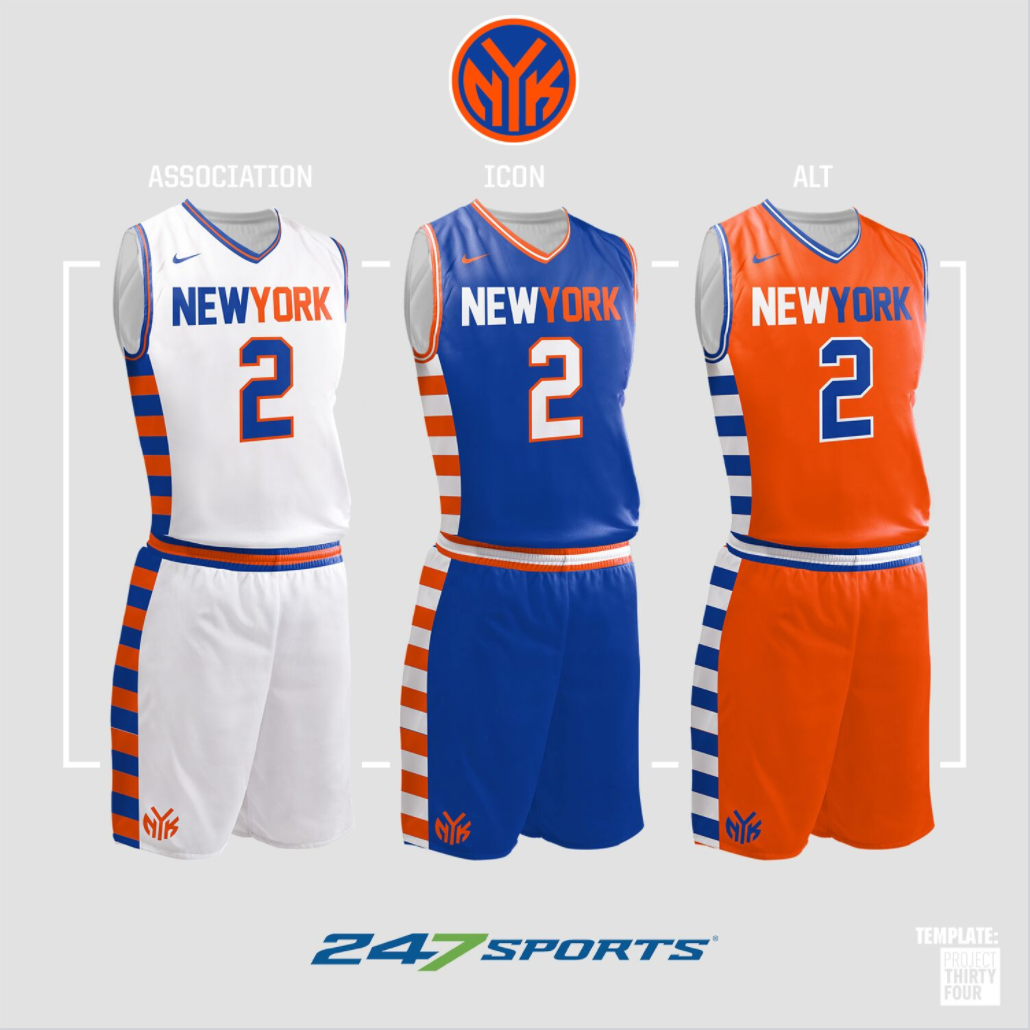
Concepts........

Ok, not great.......

"Just do it"? Oh, please don't ever do that!!
Fail.
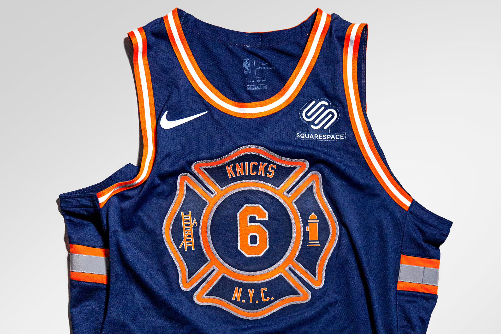
Not a concept. THis has been used recently. I like it for a special edition.
I like the subway token reference but not the way its executed here.....

For the Pagan logo fans.....Not for me.
 Variations of familiar.

This concept is not done well but the side Empire state is interesting. Perhaps done in blue or toned down it could be an interesting treatment. Not liking the front "knicks" at all.

The original NY team, the Harlem Rens (Renaissance). I thought tne Nets using the Black and white retro feel was sort of paying homage to this heritage.
https://www.nytimes.com/slideshow/2014/0...html