Nalod wrote:Concepts........

Ok, not great.......

"Just do it"? Oh, please don't ever do that!!
Fail.
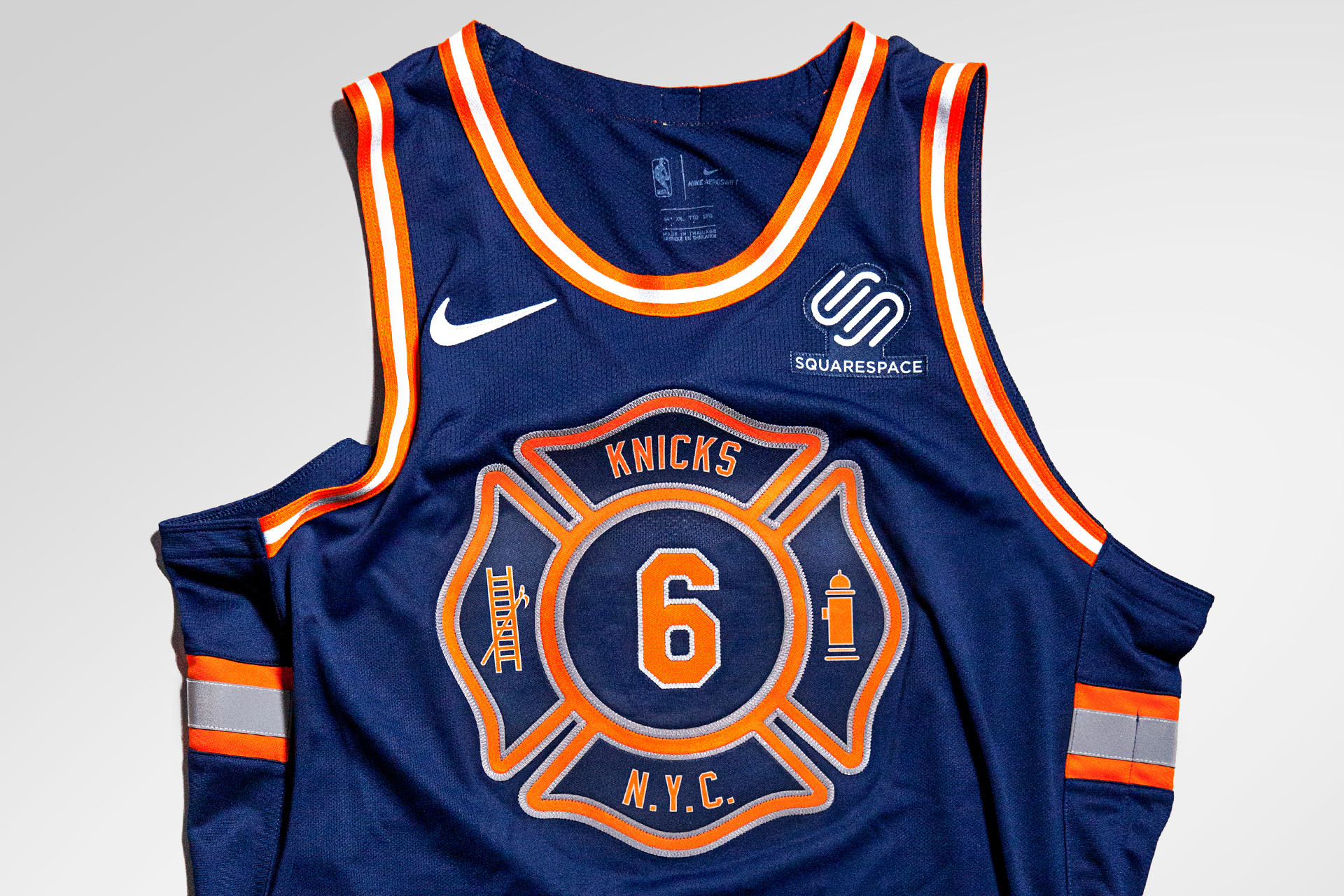
Not a concept. THis has been used recently. I like it for a special edition.
I like the subway token reference but not the way its executed here.....

For the Pagan logo fans.....Not for me.
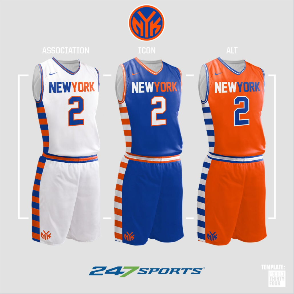
 Variations of familiar.

This concept is not done well but the side Empire state is interesting. Perhaps done in blue or toned down it could be an interesting treatment. Not liking the front "knicks" at all.

The original NY team, the Harlem Rens (Renaissance). I thought tne Nets using the Black and white retro feel was sort of paying homage to this heritage.
https://www.nytimes.com/slideshow/2014/0...html
I like the subway tokens one and the ones where you typed variations of familiar.
Nalod wrote:
This one is not good as is, but I feel like it's close.. Just use the normal blue, get rid of the wings on the token or whatever the heck that is, drop the token down a little, and make the 'Y' in the token not look like a freaking tree. Get rid of the NYC in the shorts and either just have the stripes or steal from the other ideas and put the Empire State Building or something
SupremeCommander wrote:Nalod wrote:
This one is not good as is, but I feel like it's close.. Just use the normal blue, get rid of the wings on the token or whatever the heck that is, drop the token down a little, and make the 'Y' in the token not look like a freaking tree. Get rid of the NYC in the shorts and either just have the stripes or steal from the other ideas and put the Empire State Building or something
It has flaws but the colors and token size are perfect. I like that light blue road jersey the best. It’s updated but not out of line.
Allanfan20 wrote:SupremeCommander wrote:Nalod wrote:
This one is not good as is, but I feel like it's close.. Just use the normal blue, get rid of the wings on the token or whatever the heck that is, drop the token down a little, and make the 'Y' in the token not look like a freaking tree. Get rid of the NYC in the shorts and either just have the stripes or steal from the other ideas and put the Empire State Building or something
It has flaws but the colors and token size are perfect. I like that light blue road jersey the best. It’s updated but not out of line.
it looks like a third uni to me. I hate when that's the case. The thirds should just look a version of the other two imho