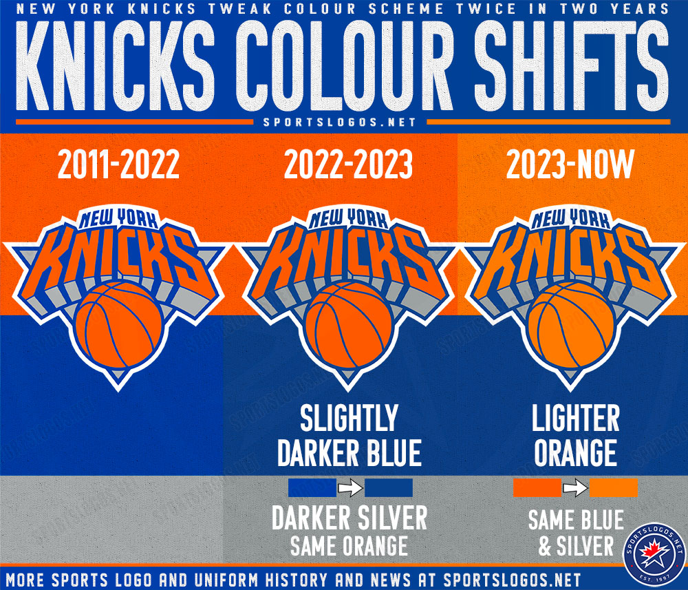
I know the Knicks have changed their colours over the past two seasons (darker blue last year, lighter orange this year), but the center court logo looks awful to me.
The orange on the center court logo really looks bland, pale... have you noticed this as well ?
Its about TV and how in the digital video picks up “Reds”………Its always been a bit of an issue as for reasons I don’t know reproducing the color red is harder than any other. My guess is either the technology has improved and thus they keep having to tweek it so it does not look too “red”.
I did not pick up on it but it might be a reason why Randle is off to slow start?
“Orange” you glad I explained it? 
I give you credit FrenchKnicks. Still hanging tough with us even though you have every reason to jump ship to the Spurs, home to two of France's generational talents.
Never liked the 90s based logo. Looked like it was designed by a Transformer.
Been much too long without a new logo, for a new generation of Knicks fans.